The Look: Minimalist Frame Design
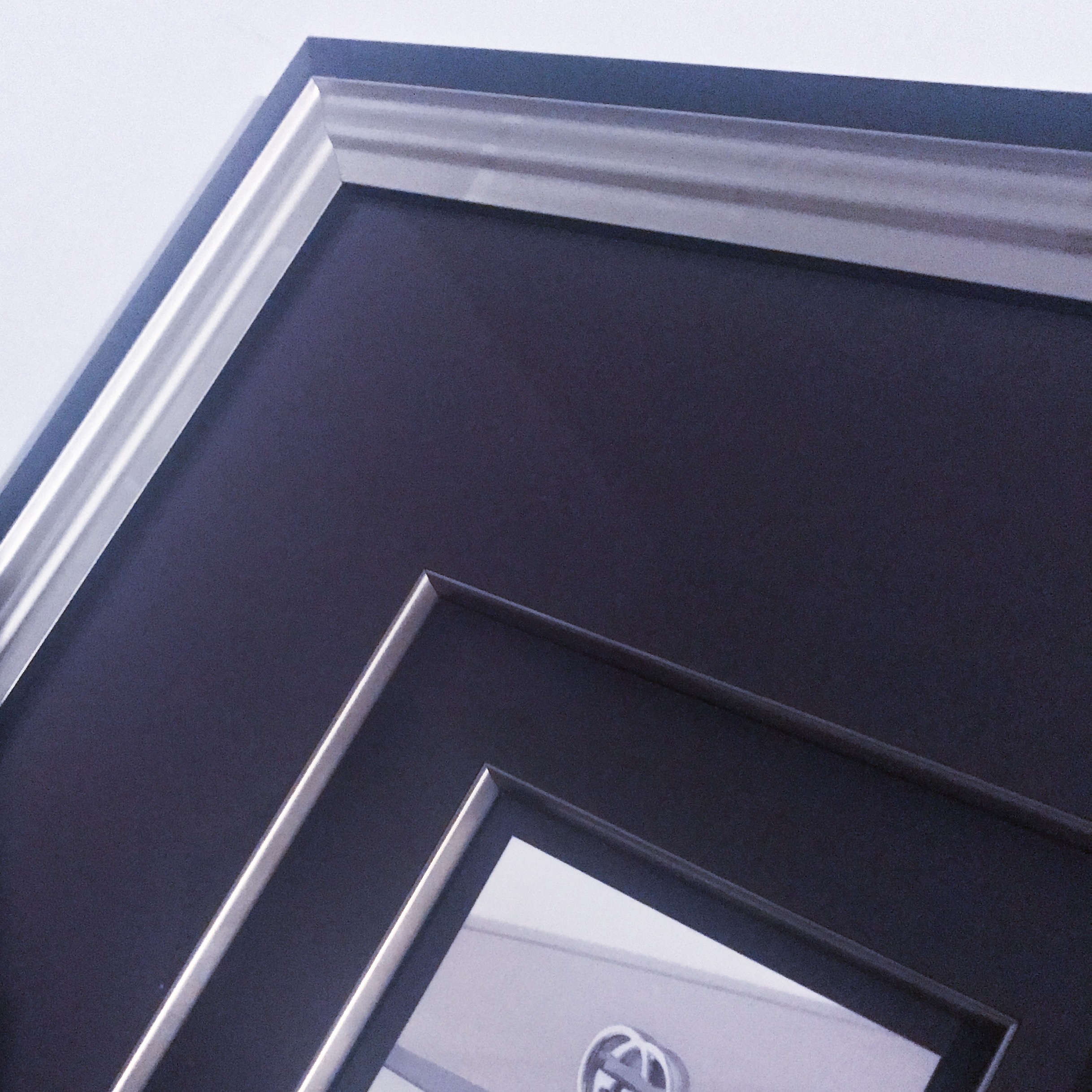
Incorporating a minimalist aesthetic into a frame design is very modern and lends itself to strategic design. Minimalism is not necessarily about simplicity, but instead, utilizing space, dimension, and fundamentals of design composition theory to achieve an intentional look.
Often clients share that they like the overall aesthetic, but they have no idea how to achieve it apart from a white matboard and basic black frame. I will show you that there are concepts to make minimalism interesting. Furthermore, minimalism allows for a thought out approach to what you love about your art collection and what you want to communicate through design.
In this post, I will provide design tips on how to achieve an intricate and personalized minimal frame design and what to consider while incorporating these concepts into an interior space..
1) Use larger mat margins
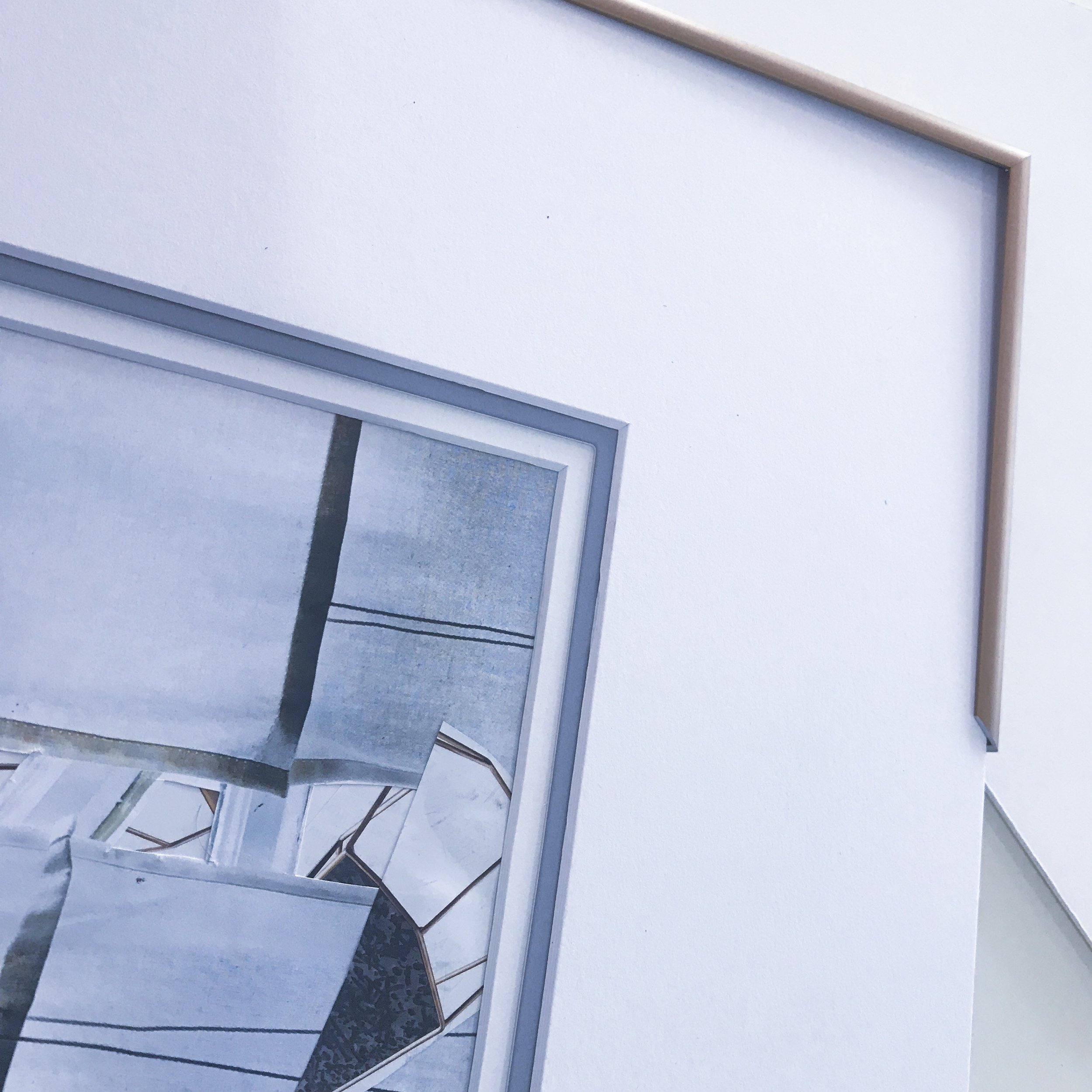
Use of negative space is everything in minimalist design. A focal point in design composition is the main feature of the composition, and wider mat margins place the art in its entirety as a focal point within a larger amount of negative space. Additionally, more spacing means more expansiveness. I like to think of this as the frame design equivalent to decluttering- the frequent first step in achieving a minimalist interior.
2) Consider proportion.
Minimal or not, appropriate proportion is essential for great frame design. Consider proportion present in the subject of the art itself, the mat margins, the width and depth of the frame, and the wall space where the art will be hung. Look to the relationship in all the spacing within the composition to ensure that nothing feels crowded. Greater contrast of proportion is always ok.
3) Layering and repetition
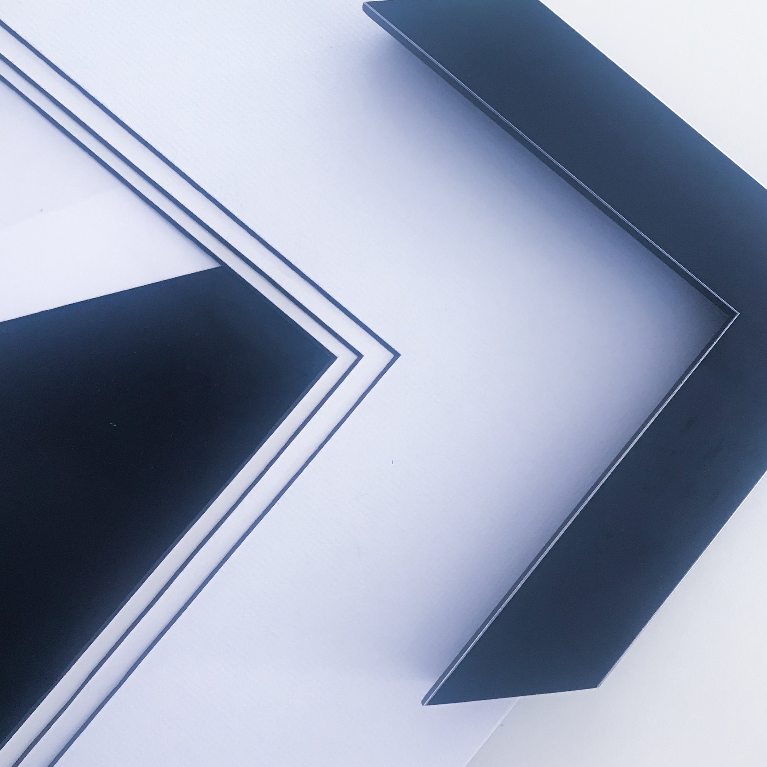
This is where simplicity really comes in to play in that people often want to keep the design "minimal" by opting for basic. This is a misconception because layering matboards and fillets adds more depth and subtlety- integral qualities to minimal design. Layering matboards creates a physical depth, but also allows opportunity to support the piece through undertones or repetition.
First, when I say undertones, I am referring to the colors in the piece that are less obvious. Color and shading play strong roles in the illusion of 3D, so naturally, emphasizing certain colors present in the art will contribute to the perception of dimension. Often you want this as an accent matboard or accent within the frame to avoid it overpowering the design.
Second, repetition works for minimal design because it is essentially adding to the design without adding any new design elements. We can honestly say that when the piece calls for repetition, minimal or not, the result is stunning. We generally apply repetition according to universal standards of proportion (i.e. the golden mean) and this keeps it from looking stagnant. When you appropriately repeat a theme of design it creates a focus, balance, depth, and direction that is subtle but strong.
4) Consider depth of the frame to your advantage
Limited wall space is a frequent problem in San Francisco, so an alternative way to create more space is to max out the interior walls of the frame, specifically, the space between the art and glass. Working with a deeper frame adds a subtle layer of dimension and continuity that can often add just the right amount of breathing room if wider mat margins are not a spacial option. A shadowbox is the most extreme example of this, holding its title due to its nature to cast a shadow within the frame package.
Alternatively, you can play with light and depth through spacing in between each matboard layer or "floating" the art above the mat. Depth often is the most understated and impactful way to add dimensionality to a minimal design.
5) Explore the effect of shapes and lines within the frame and matting
As I shared, minimalism and design theory are to a degree a science based on geometry. For this reason, the frame profile is able to influence the overall depth and structure of the piece. Frames with contemporary shapes, for example steep bevels or angular facings, influence directionality and reflection of light.
Another way this works is based on storytelling within an image. Your eye goes to a certain point first, the focal point, and then it carries through the lines or subject matter to other parts of the piece. Shapes and lines all play a strong role in the storyline of minimal design, and reflecting that in the frame design holds an impact.
6) When to use accent colors, texture, or ornate frames.
The way I approach adding new elements to a minimal design is to consider the entire layout of the space (i.e. your interior), weigh out the effect of all the components, and determine what within the space you want to have the most emphasis. The effect that minimalist interiors have is that subtle elements are able to have a voice within the layout because they are not being overpowered. For example, ff you look at monochromatic interiors you see that even a certain shade of grey or a wood grain will add an accent feature. Weigh out the degree to which the new feature will be emphasized and to what intensity. Some of our frames have subtle texture or shapes over a matte finish, so these are examples of subtle accents that add complexity without distraction.
7) Personalization
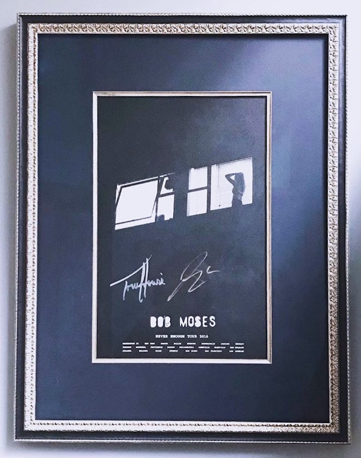
It is my perspective that your preferences are your own, and you have the freedom to incorporate what you like into a minimalist concept. How this carries through for me personally is that I love minimalism, but I also love ornate and industrial. I actually find that these elements combine very well because the ornate stands out against the monochromatic surroundings and the industriousness adds additional monochromatic or metallic finish and texture.
Your style is yours to decide, and the beauty of minimalism is that it can be an exploration of eliminating what is not strong within your aesthetic to allow what is strong to stand out. The main factor here is what you love the most should stand out the most within the composition.
If this topic interests you, please comment below. We appreciate your thoughts and would love to hear any way that you have incorporated minimalism into your art and interior space.
Also, we are happy to guide any of these concepts in the frame design for your art. Contact me andrea@aspectframing.com or come by our store during business hours. Thank you so much for reading!


